Let me tell you something
/ Visual Identity Design /
/ Client / Angela Hui Wai Nok
/ Year / 2021
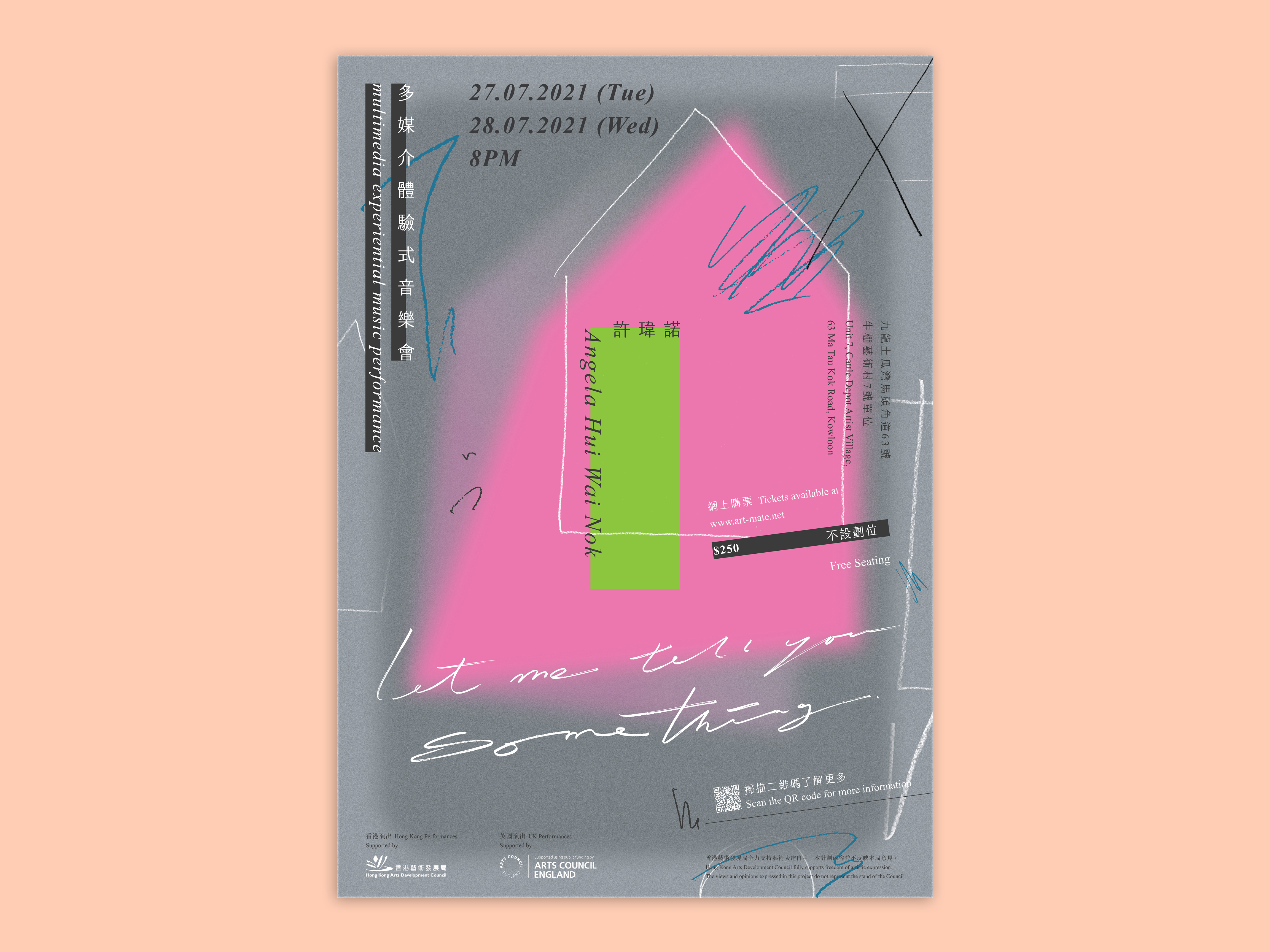
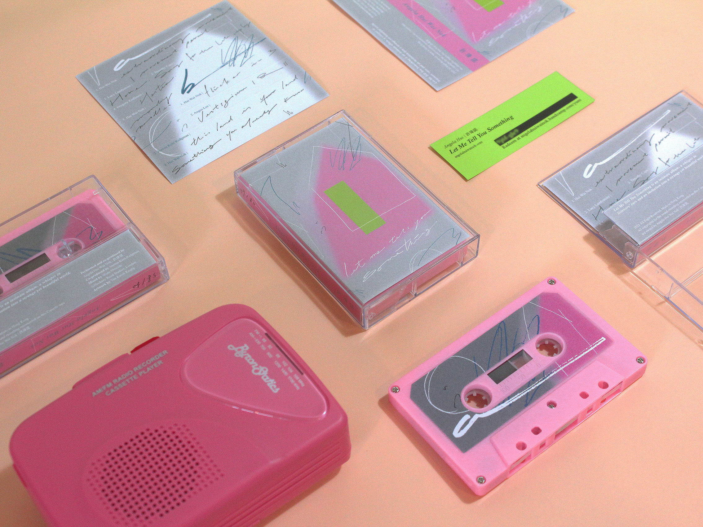
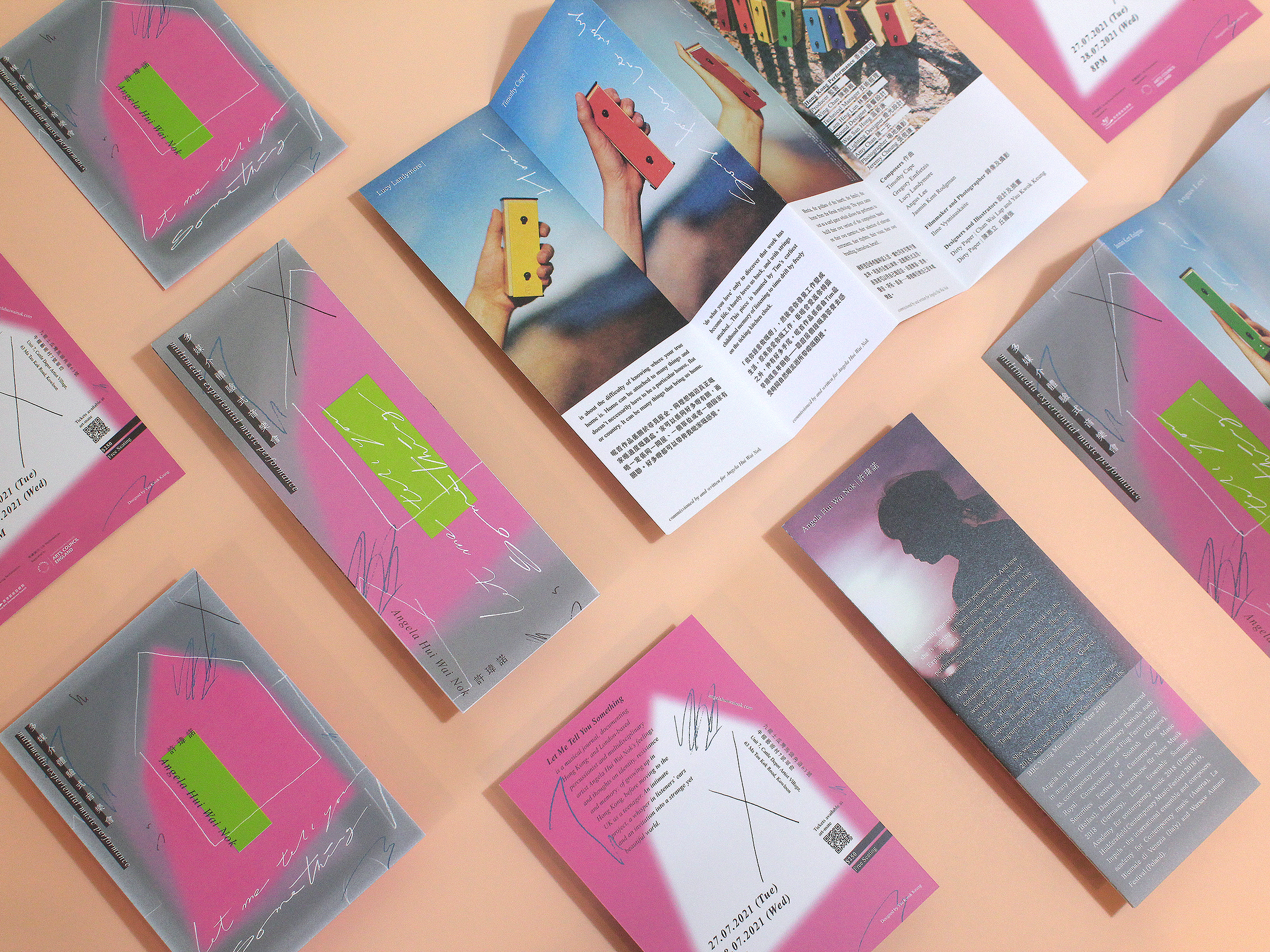
“Let me tell you something” is the intimate conversations of Angela Hui Wai Nok’s and both Hong Kong and London based composers’ , by recalling her private experiences and emotions, different percussion instruments and daily objects were used to create an abstract and touching new music album. Then stared another conversation with the audiences through her multimedia experiential music performance, to share her unforgettable experiences.
A house was used as a representation of the visual identity of the music performance, adopted to the poster, postcard, program note and cassette album design. A children drawing like house combined with inconsistent weights shows the confusion of hers, while the green colour block symbolised the glockenspiel that frequently used in her songs and performance, as a metaphor of a door or a window, leading the audiences to experience the chaos and confusion of herself.
/ Visual Identity Design /
/ Client / Angela Hui Wai Nok
/ Year / 2021
“Let me tell you something” is the intimate conversations of Angela Hui Wai Nok’s and both Hong Kong and London based composers’ , by recalling her private experiences and emotions, different percussion instruments and daily objects were used to create an abstract and touching new music album. Then stared another conversation with the audiences through her multimedia experiential music performance, to share her unforgettable experiences.
A house was used as a representation of the visual identity of the music performance, adopted to the poster, postcard, program note and cassette album design. A children drawing like house combined with inconsistent weights shows the confusion of hers, while the green colour block symbolised the glockenspiel that frequently used in her songs and performance, as a metaphor of a door or a window, leading the audiences to experience the chaos and confusion of herself.
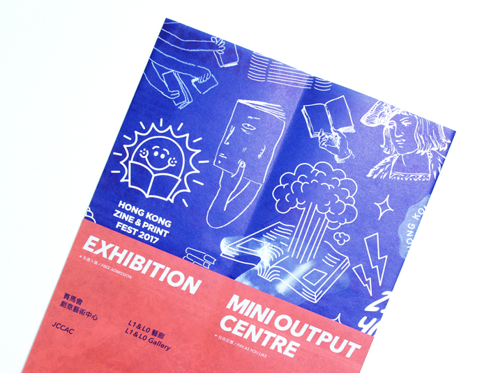
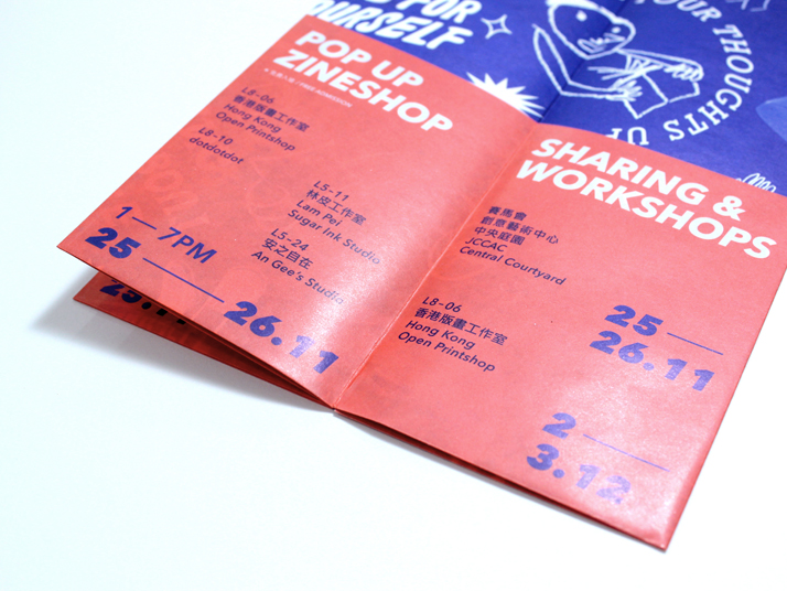
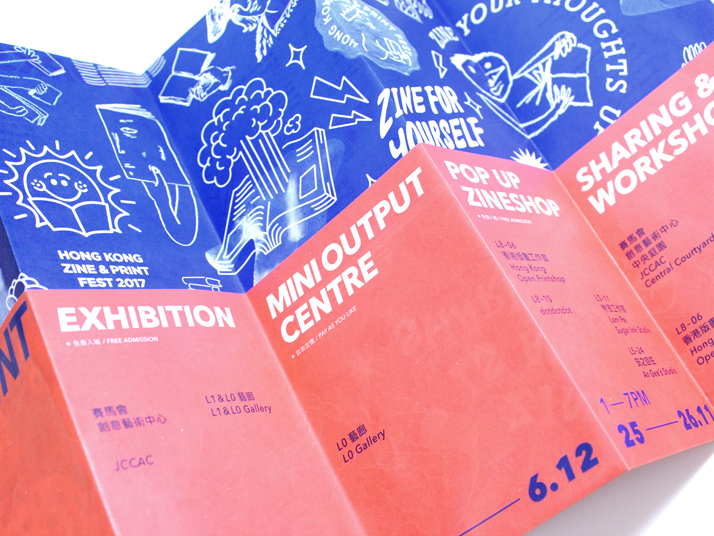
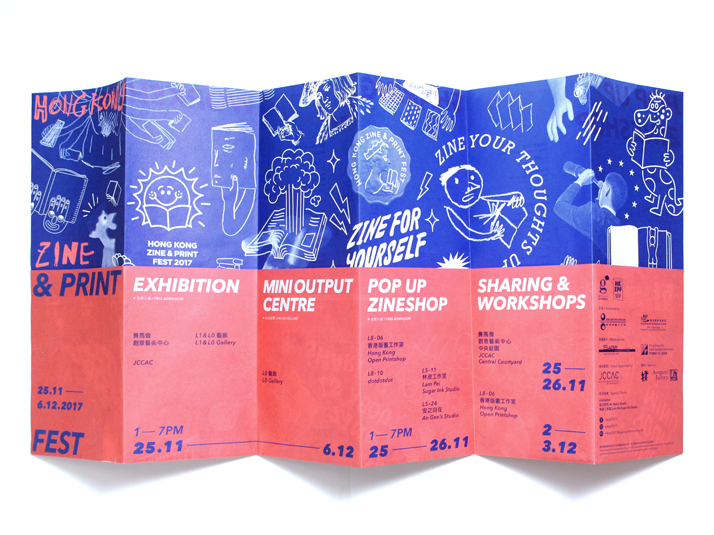
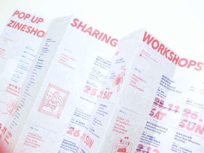
Hong Kong Zine & Print Fest
/ Client / Hong Kong Open Printshop
/ Cooperate work with Gus Cheung
/ Year / 2017
/ Visual Identity Design / Pamphlet Design /
/ Cooperate work with Gus Cheung
/ Year / 2017
A poster leaflet design for the program of Hong Kong Zine & Print Fest.


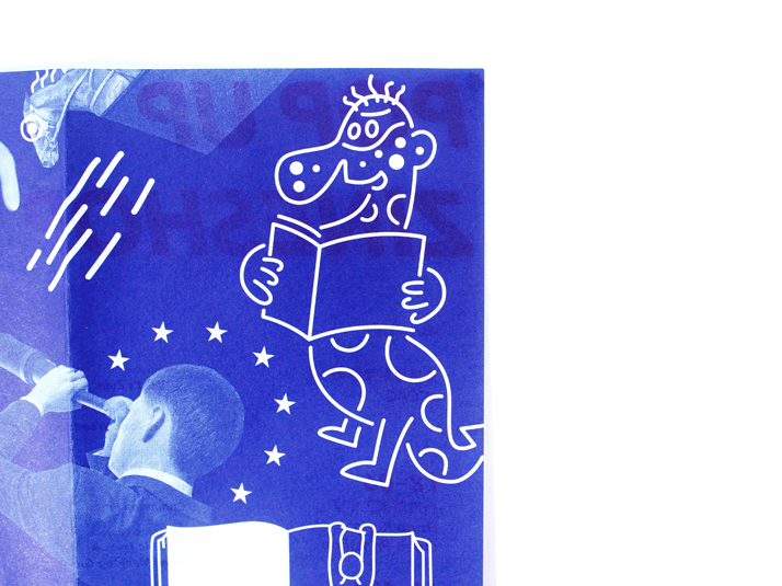
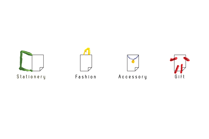
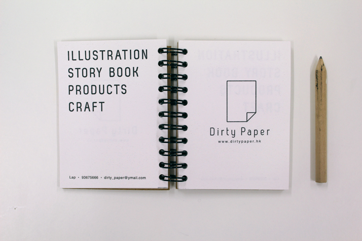
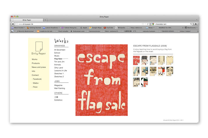
Dirty Paper
/ Year / 2011
Dirty Paper, an art collective formed by Lap and Keung since 2010. Their works represented their memories, experiences or those ridiculous things happened from their surroundings.
/ Branding / Visual Identity /
/ Client / Dirty Paper / Year / 2011
Dirty Paper, an art collective formed by Lap and Keung since 2010. Their works represented their memories, experiences or those ridiculous things happened from their surroundings.


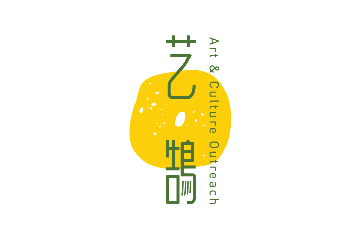
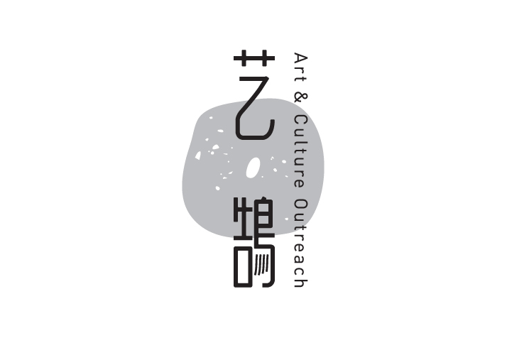
ART & CULTURE OUTREACH
/ Visual Identity Design /
/ Client / 艺鵠
/ Year / 2014
Logo redesign for ACO 艺鵠
A space to grow. Using soil as a metaphor for ACO, which is a space with different nutrition to let different art and cultural start and grow.
/ Client / 艺鵠
/ Year / 2014
Logo redesign for ACO 艺鵠
A space to grow. Using soil as a metaphor for ACO, which is a space with different nutrition to let different art and cultural start and grow.


SUSHI EXPRESS
/ Branding / Visual Identity /
/ Sushi Express Logo Design Competition
/ Year / 2014
設計以魚的造型為中心,「鮮」的魚字邊旁形象化,融入爭鮮二字,創造一個新字,比喻爭鮮的食品不但新鮮,更叫人充滿驚喜及期待 。 圖像化設計簡潔易讀,配以類近三文魚刺身的橙色,帶出新鮮、創新及活力的感覺。
另外,魚的造形亦是品牌主要的視覺元素,多變的應用方法不但帶出創新及活力的感覺,更令爭鮮的品牌形象變得統一鮮明。
/ Year / 2014
設計以魚的造型為中心,「鮮」的魚字邊旁形象化,融入爭鮮二字,創造一個新字,比喻爭鮮的食品不但新鮮,更叫人充滿驚喜及期待 。 圖像化設計簡潔易讀,配以類近三文魚刺身的橙色,帶出新鮮、創新及活力的感覺。
另外,魚的造形亦是品牌主要的視覺元素,多變的應用方法不但帶出創新及活力的感覺,更令爭鮮的品牌形象變得統一鮮明。


